The Ultimate 20-Point Checklist For Building High-Converting Landing Pages
As marketers, we know our campaigns will often live or die based on the quality of the landing pages we send traffic to. Creating a landing page that actually converts is about understanding your audience and guiding people toward action with clarity and care.
Whether you’re targeting leads, product sign-ups or demo bookings, every element on the page needs to work together with purpose. That’s why we’ve put together this 20-point checklist to help you build landing pages that don’t just look great, but drive real results.
Let’s get into it!
1. Site navigation and links
Every link is a potential distraction. Reducing exit points keeps visitors focused on your core conversion goal. But all journeys are not very straightforward - B2B buyers, especially, might want to explore a website more thoroughly before signing up. This is why keeping people hooked on your landing page is important for getting a conversion.
Make sure you provide users with key information upfront and give optional deep dives through popups and collapsible sections. You can also test removing top navigation vs. offering a slim, supportive footer menu.
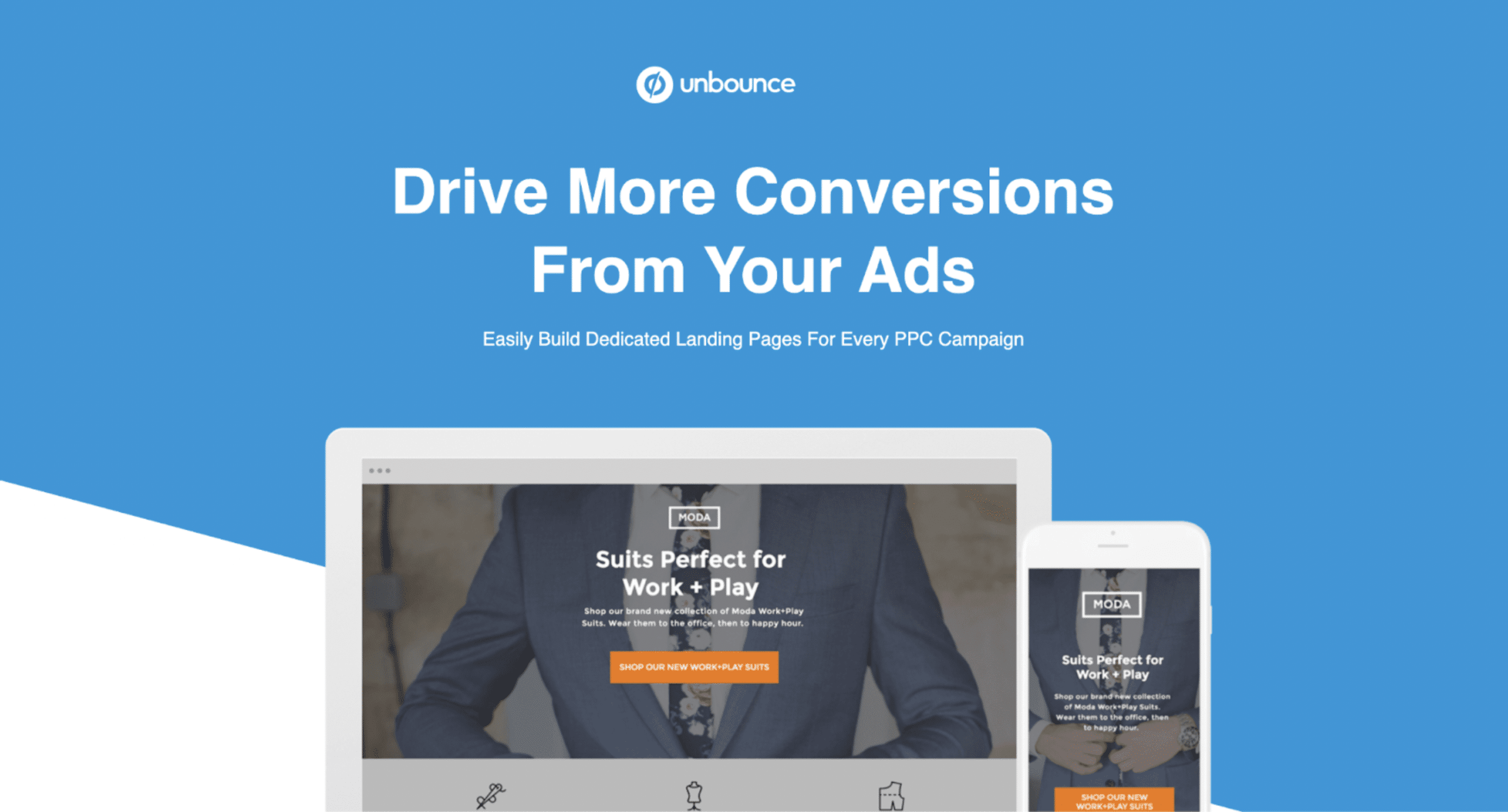
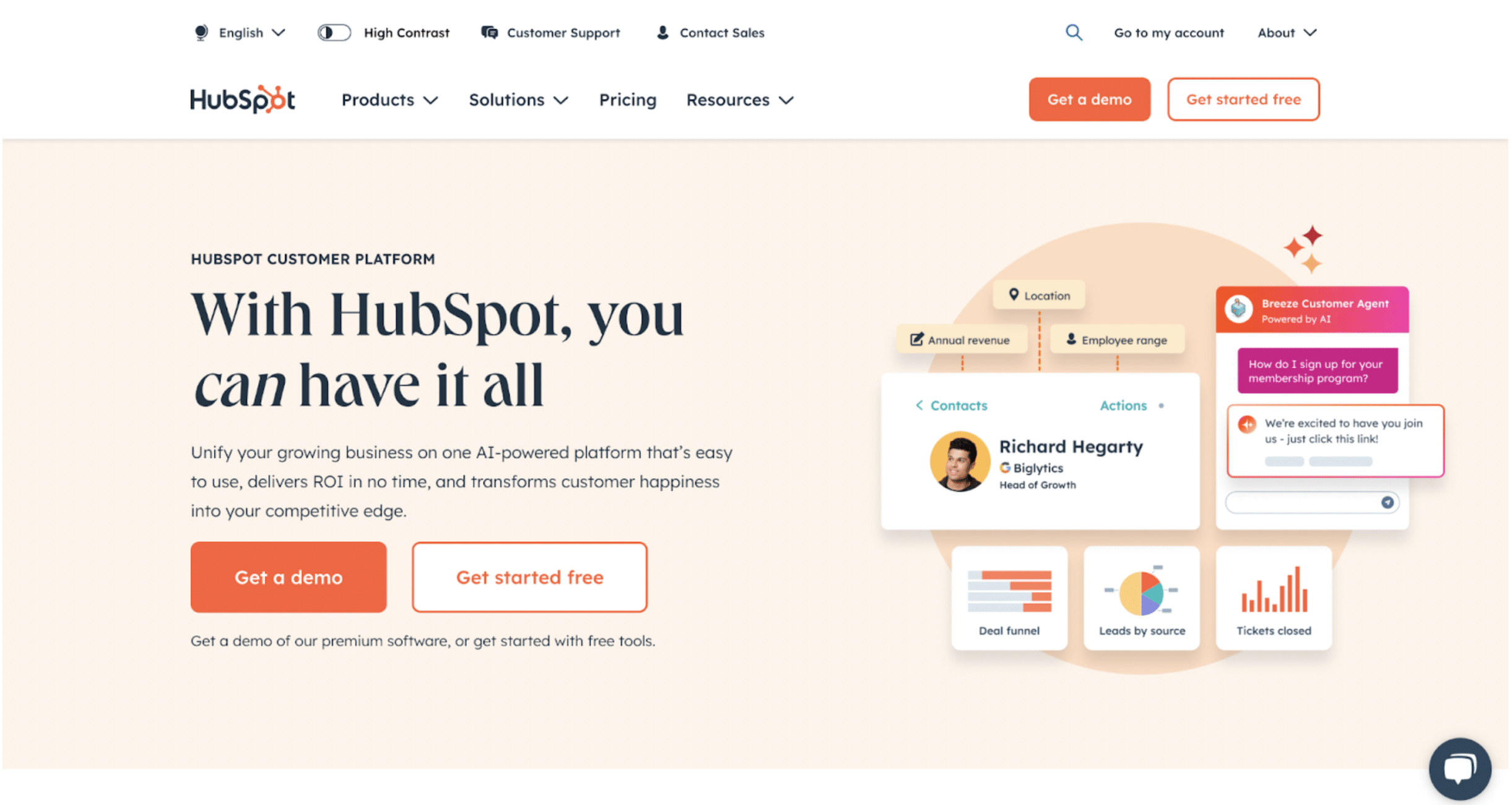
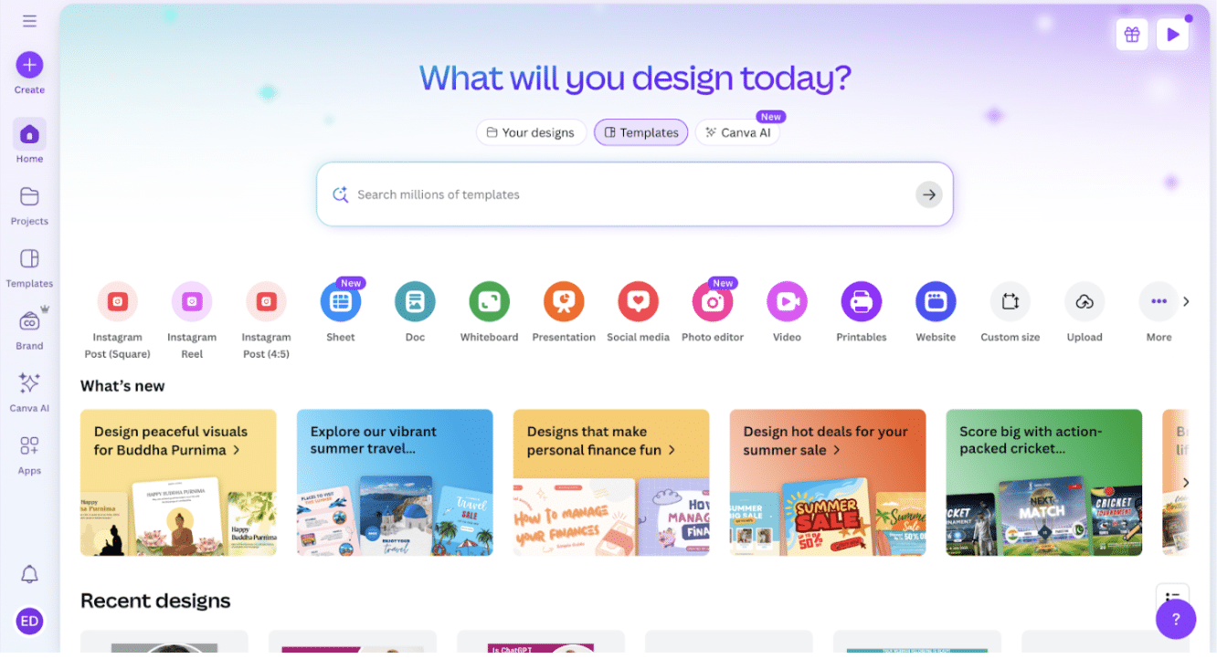
Example: Unbounce has removed nav bars from their landing pages entirely, while SaaS tools like HubSpot have retained a lightweight menu on their page.
2. Relevance
Relevant copy on landing pages helps bridge the gap between a user's intent and their website experience.
To ensure your landing page resonates with your audience, mirror the search terms or ad messaging in your headline and use audience-specific language. You can take this further by personalising content with dynamic text replacement (DTR), a technique that automatically updates the text on your landing page to match the exact keywords or phrases a visitor used in their search or clicked ad.
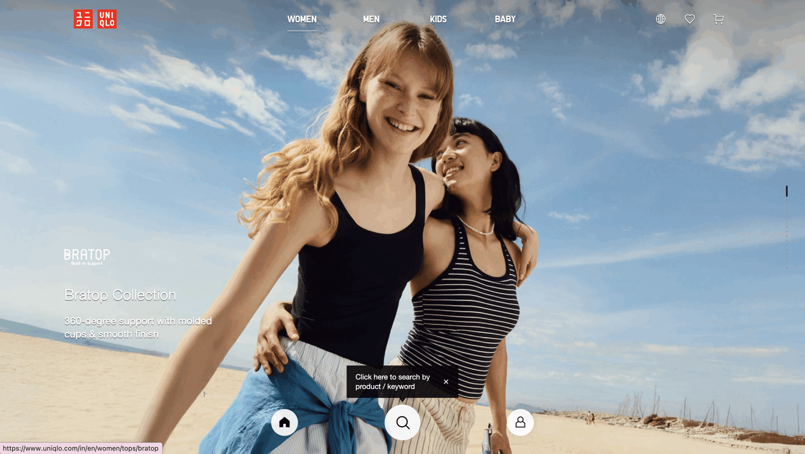
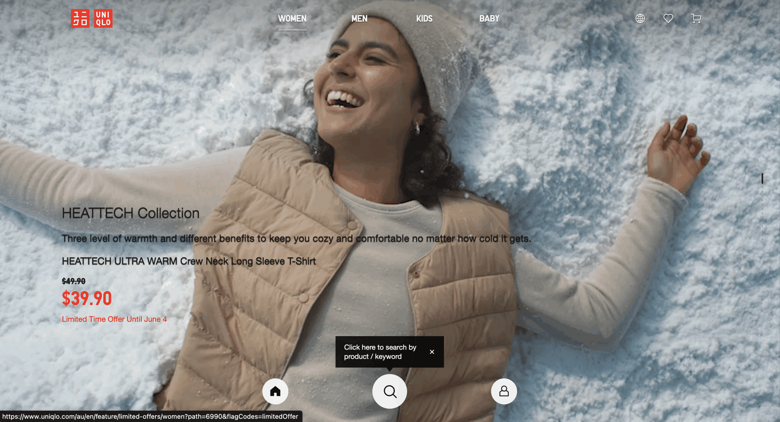
Example: Uniqlo adapts their homepage message and imagery based on location of the user. The two screenshots below are both taken on the same day - one for Uniqlo Australia, featuring winter wear and another for Uniqlo India, showing their summer collection.
3. Clarity
When people are confused, they don’t convert - they bounce. Test your landing page with this simple copywriting audit: Can a new visitor explain the purpose of the page in one sentence within five seconds?
Ideally, your page should present a single message and a single offer.
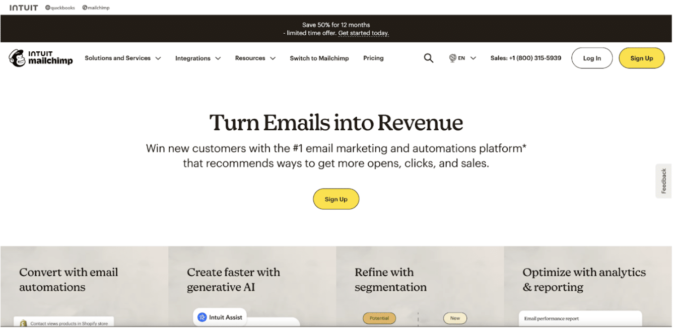
Mailchimp does a great job on their landing page by highlighting who they are and what they do from the get-go. The headline is “Turn emails into revenue”, and the subcopy explains exactly what’s on offer - an email marketing and automation platform.
4. Page speed
Every second shaved off your page load time can dramatically improve conversion rates, especially on mobile.
For high-performing landing pages, aim to minimise render-blocking scripts, compress your images and embed your videos instead of uploading them. Better page speed -> improved user experience -> more conversions.
Google themselves focused on reducing the time it takes to load search results by 0.5 seconds and saw a 20% traffic increase.
You can test the speed on your page using free tools like PageSpeed Insights.
5. Tested on all devices
Simply having a “mobile responsive” landing page design isn’t enough anymore. You need conversion-focused mobile design, and your points of conversion should be in perfect working order across different screens and devices. Pay special attention to form fields and CTA sizes.
We recommend that you use the data from your Google Analytics to understand which devices your users prefer.
Canva does this really well by adjusting the entire layout and button placement of their platform depending on the device.
6. Build urgency
Prospects are most likely to act when they think they are going to miss out. However, the fear of missing out (FOMO) works only when it’s genuine and authentic.
Use passive urgency through phrases like “Join 100s of others” or active urgency with phrases like “Only 3 spots left” to create a sense of FOMO among your audience.
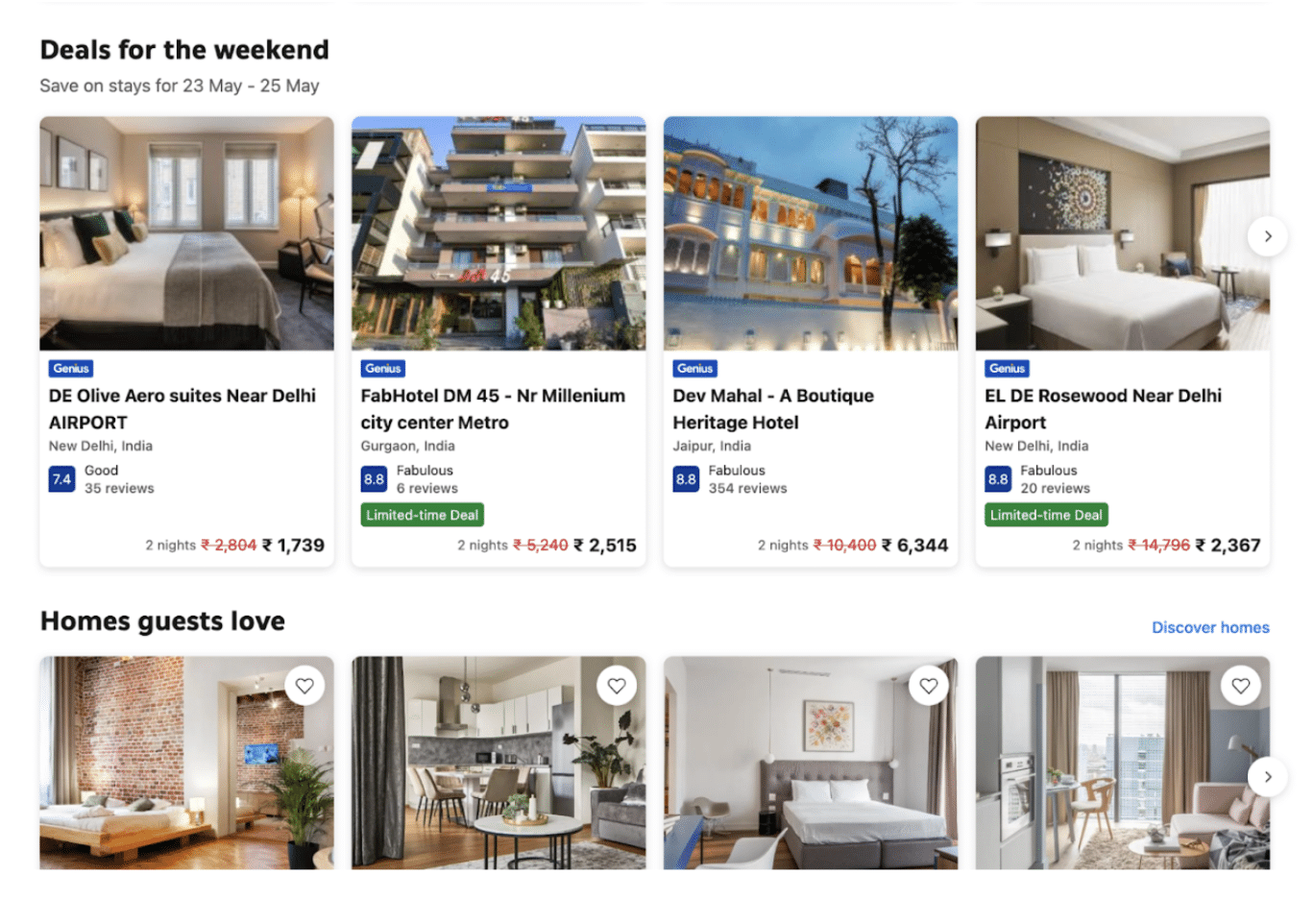
Booking.com masterfully executes this using real-time urgency cues like “2 rooms left at this price” or “Limited Time Deal”.
7. Make a compelling offer
Users convert only when your offer feels valuable to your audience, which is why your lead magnet or CTA has to address a real user problem.
Get creative and think beyond discounts. Consider offering exclusive insights into your industry’s developments, early access to a new whitepaper you’re publishing, templates and frameworks that help with decision-making, or ‘try-before-you-buy’ offers.
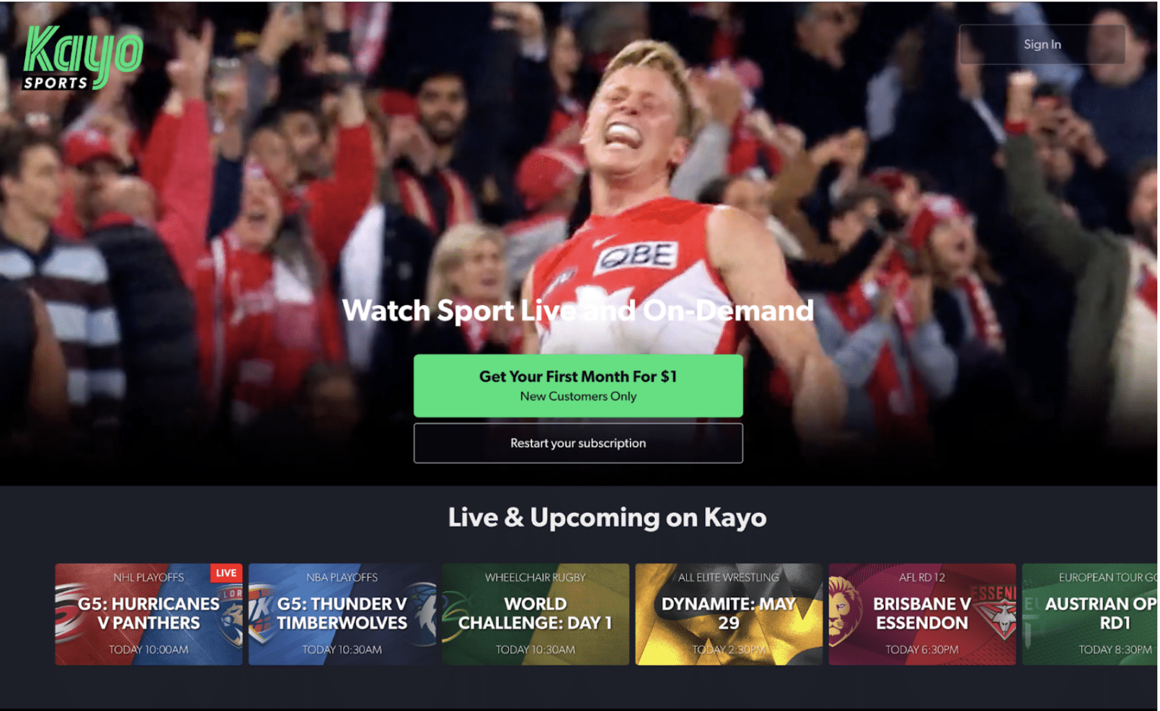
An example is Kayo’s “Get Your First Month for $1”. It’s a fantastic entry product that gives customers with higher paying potential an honest user experience of their streaming service. In a B2B scenario for a service business, you could offer a “free audit” or a “free workshop” to attract potential clients.
8. Effective UX
The most beautifully designed website can fail if users can’t figure out what to do easily. Make sure that your landing page easy to follow and meets the minimum design standards of your prospect.
For good UX you can use:
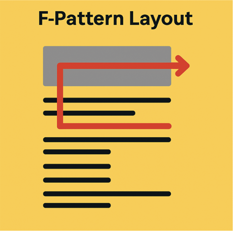
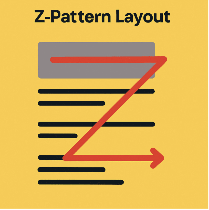
- F-pattern or Z-pattern layouts: The pattern in which you lay out your content depends on what kind of content is on your landing page, and what the end-goal is for. If you’re creating a blog, using the F-pattern layout is ideal so people can scan across the top, down the left, and make shorter, horizontal scans. For a simple landing page, it’s ideal for users to scan information from top-left to top-right, then diagonally down and across again, forming a Z-shape.
- Group related information: This helps users process content more easily and feel less overwhelmed.
- Use whitespace: Often underestimated in poorly designed landing pages, whitespace does more than just make things look clean; it shapes how users read, feel and act on a landing page.
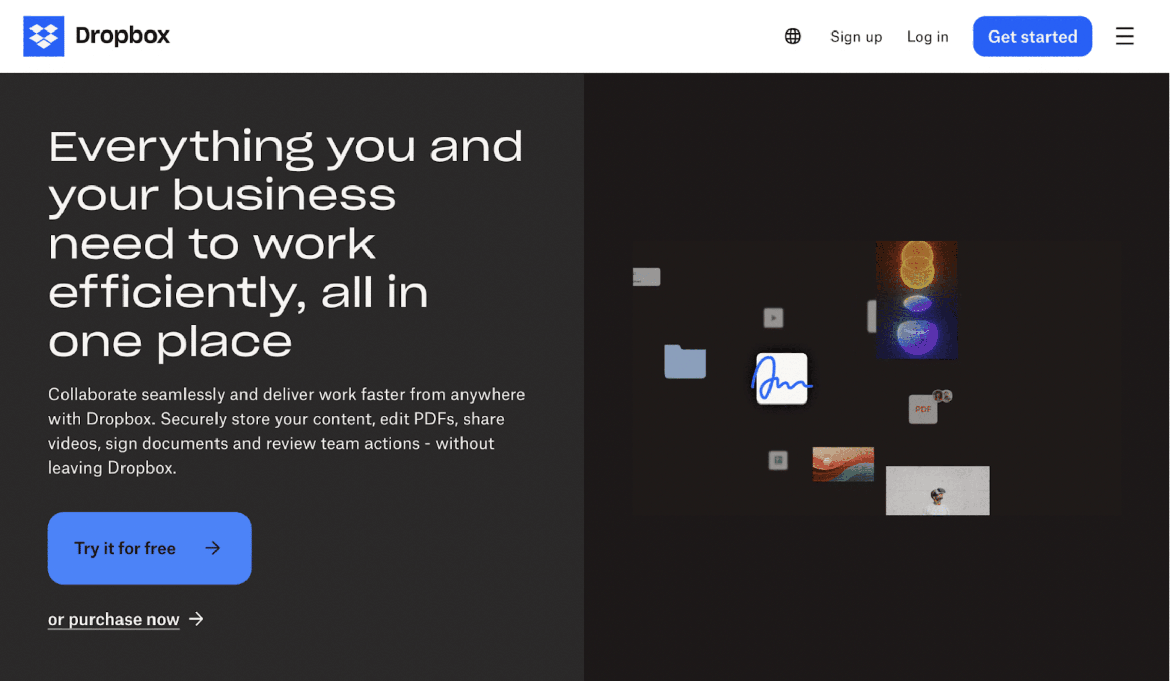
Dropbox offers a compelling UX on their landing page. They use visual hierarchy to guide users directly to their CTA and reducing distractions.
9. Simplicity
Can the average prospect understand exactly what you are offering in less than five seconds?
Simple communication builds trust and makes action easier. An honest offering is straightforward and gets to the point fast. Use short sentences, bullets and plain language. Don’t make users work hard to figure things out.
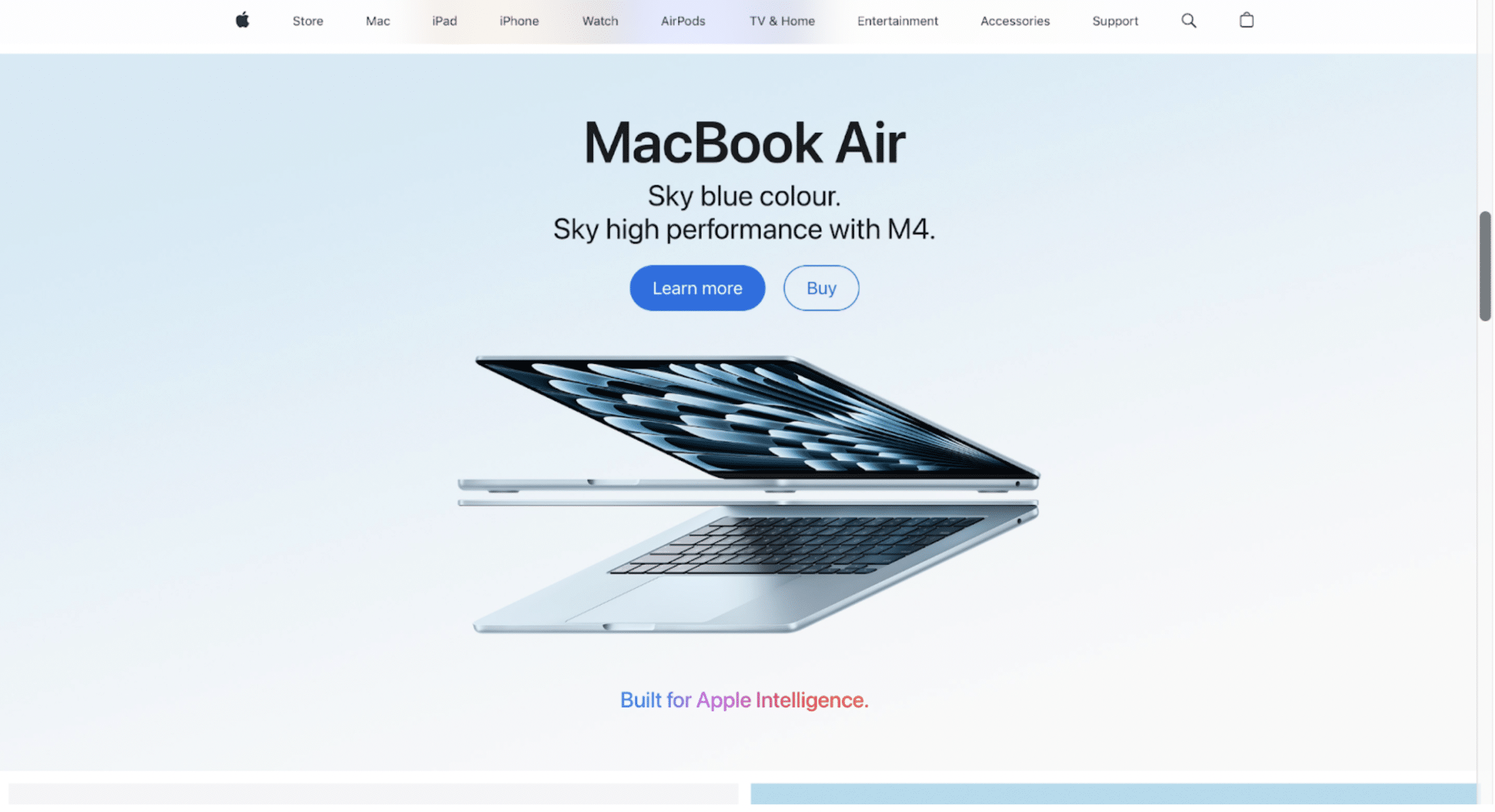
For instance, Apple’s product pages excel in simplicity, which is also their USP - one bold message, one hero image, one primary action.
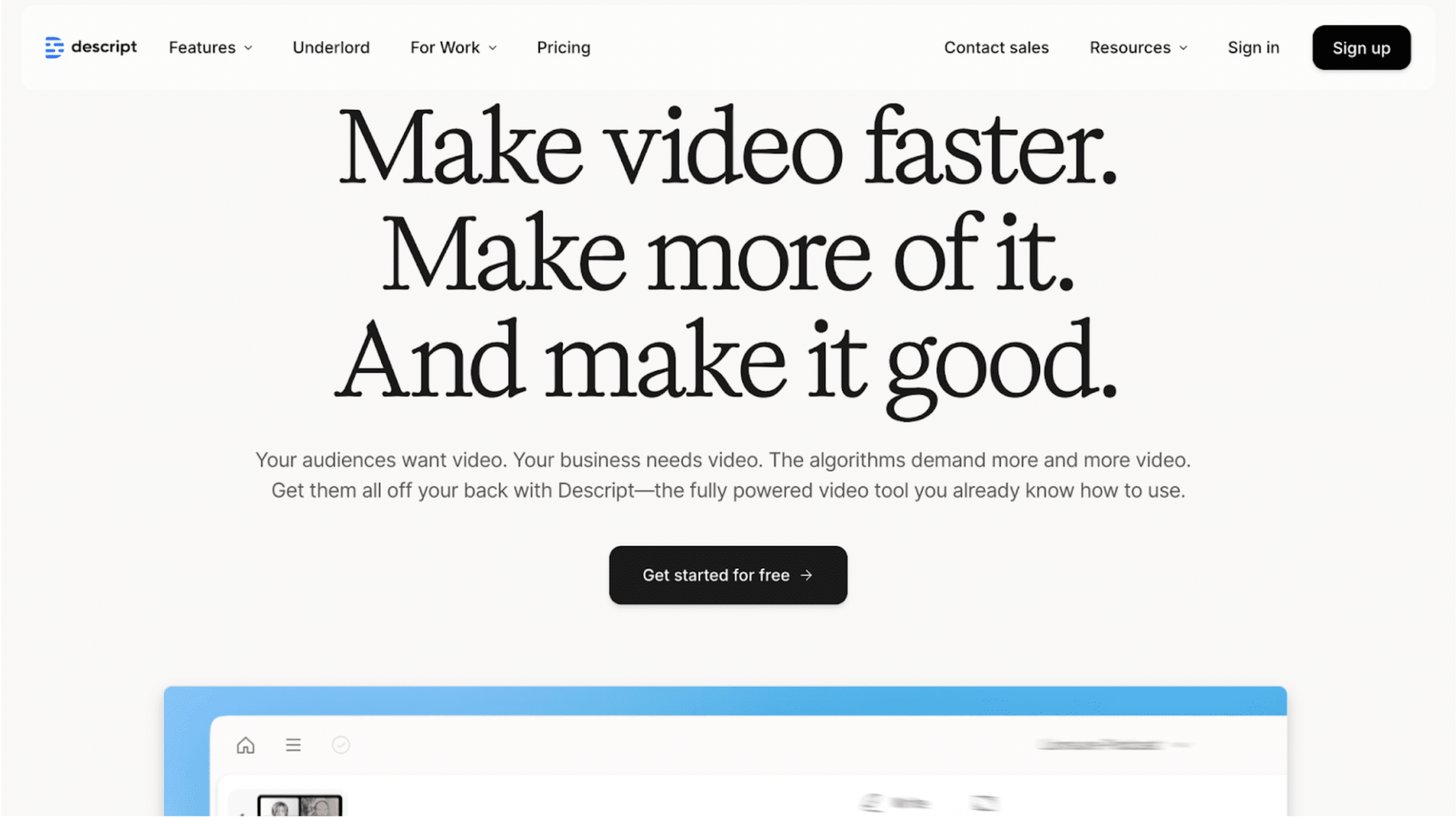
10. Compelling headline and subhead
Your headline is your hook.
It must be clear, concise and benefit-rich. Use frameworks like “How to X without Y” or “Get [Result] in [Timeframe]” for your headlines. A subheading can assist with additional clarity and support your value proposition with context or urgency.
For example, Descript gets to the point from the get-go - their headline, “Make videos faster”, is both compelling and action-oriented.
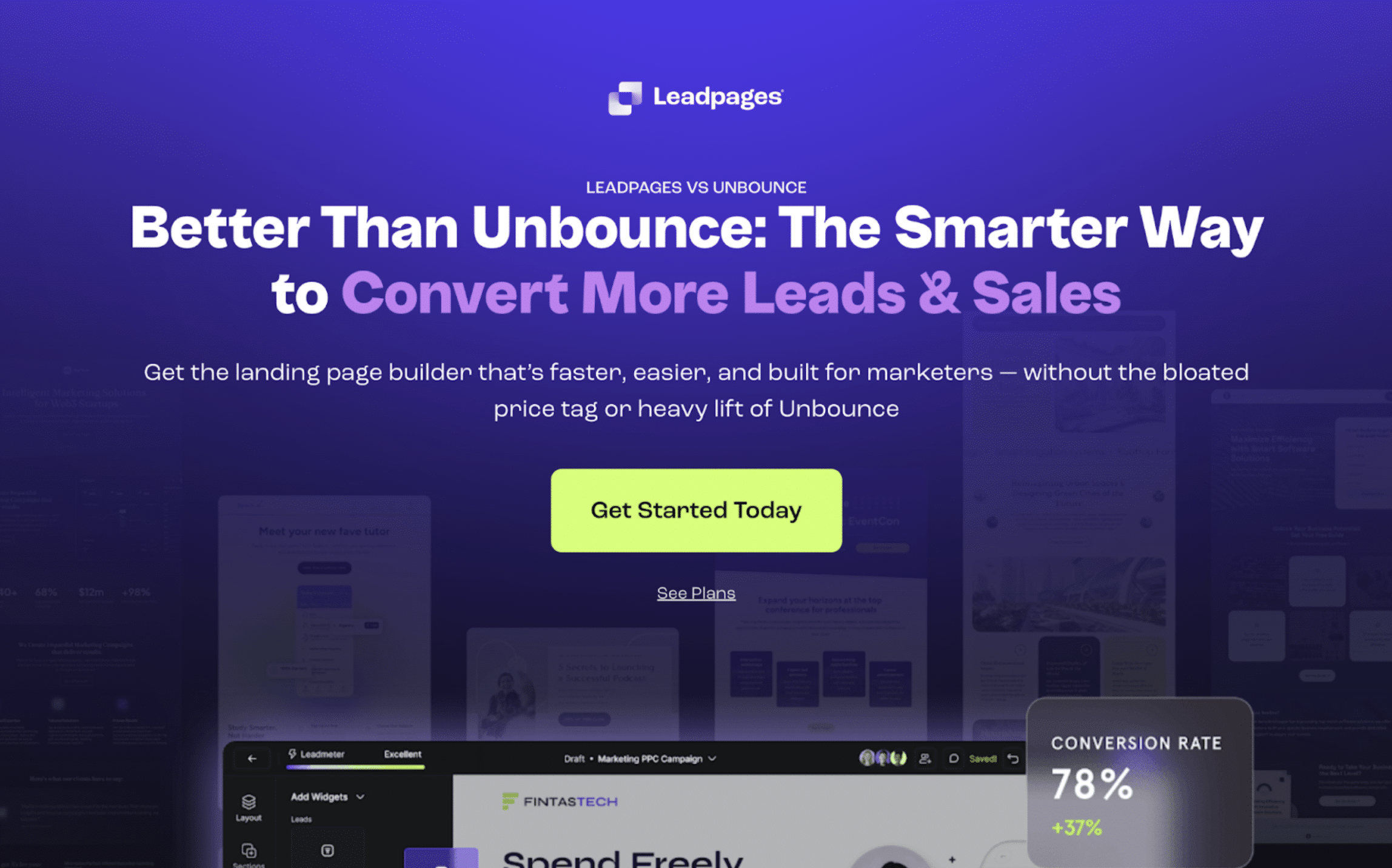
11. The button must stand out
Buttons should demand attention, not blend with the design of your landing page. The CTA should be the most visually dominant element. Use a contrasting colour, consistent shape and clear hover states. Make it feel interactive.
Leadpages uses an eye-catching lime green CTA button with generous padding and prominent placement to grab user attention.
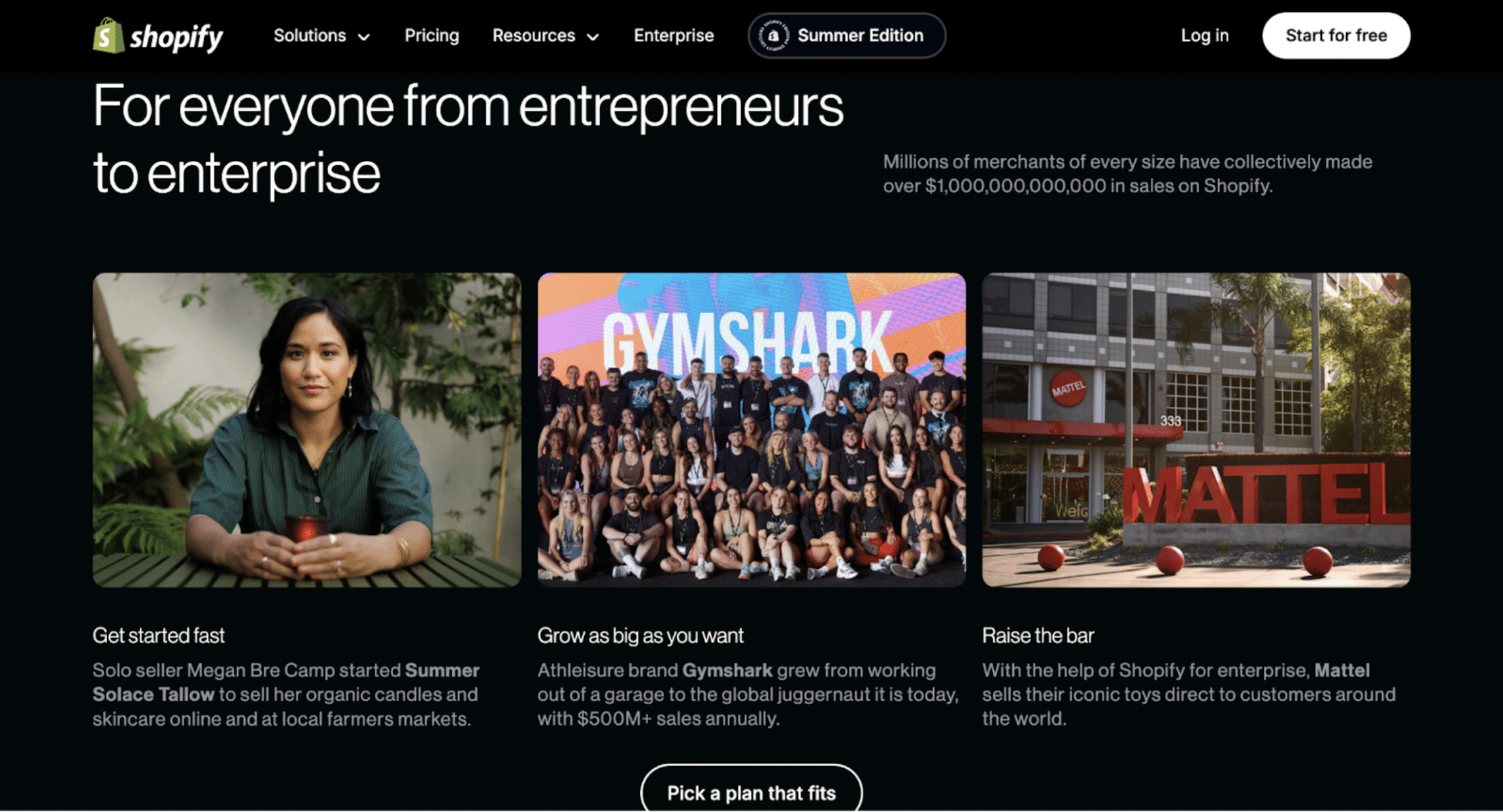
12. Use custom button text
Generic CTAs like “Submit” kill momentum because of how overused they are.
Don’t be scared of buttons with a lot of relevant copy that use verbs that communicate specific value: “Claim My Free Demo”, “Start My Free 14-Day Trial”, “Download the Guide Now” or all examples of great CTA texts.
Shopify implements strong CTAs - “Start for free” and “Pick a plan that fits” - are both benefit-rich, low-risk and action-oriented.
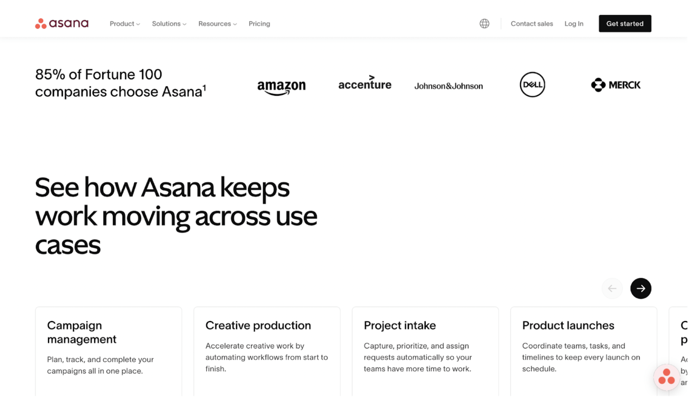
13. Social proof
Prospects just won’t take your word for it. Humans trust humans to the point that even anonymous trust (like review scores or client logos) helps reduce uncertainty among your target audience.
Use multiple types of social proof to build brand credibility and display them on your landing page through widgets for star ratings, video testimonials, logos, user stats, awards, or UGC.
Take Asana for example. Their claim that “85% of Fortune 100 companies” chose them combined with recognisable client logos, fills users with confidence about their product even before trying it themselves.
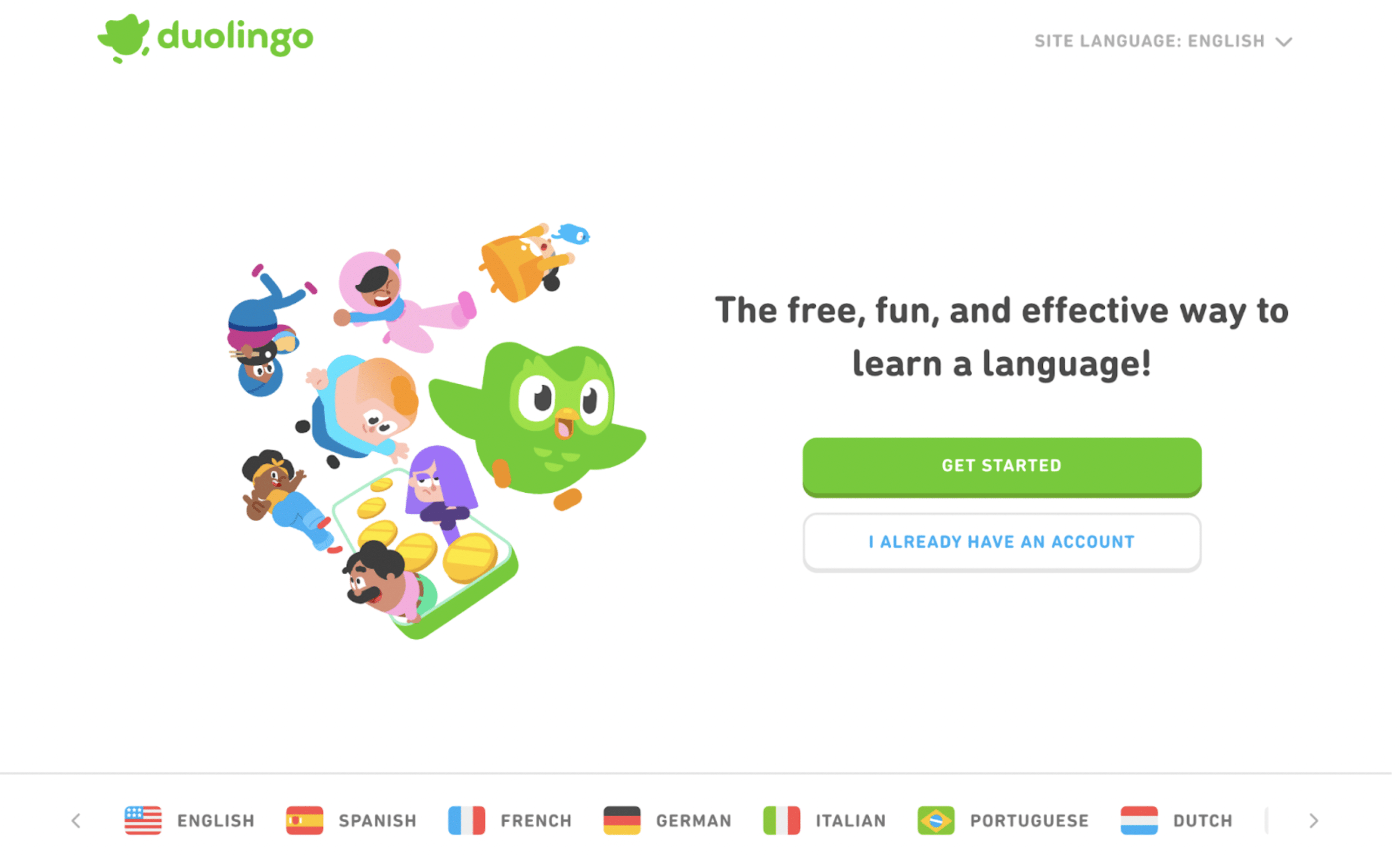
14. Use visual cues
When done right, design is an immensely powerful tool that can guide user attention using shapes, imagery and motion. Use arrows, eye-line direction in images, movement, or background contrast to nudge users toward the next step.
Duolingo does a fantastic job at this on their home page really cool animated visuals that make a lasting impression.
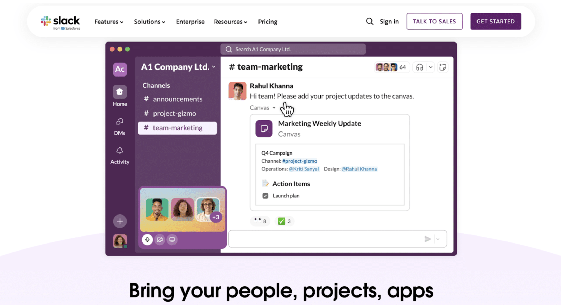
15. Make the hero shot count
Your hero image should reinforce your offer to your target audience, not just look nice. Try adding product-in-use images, before/after mockups, or emotional response photography that supports your CTA.
Check out the hero imagery on the Slack homepage. They show users collaborating in a Slack interface, making their landing page relatable.
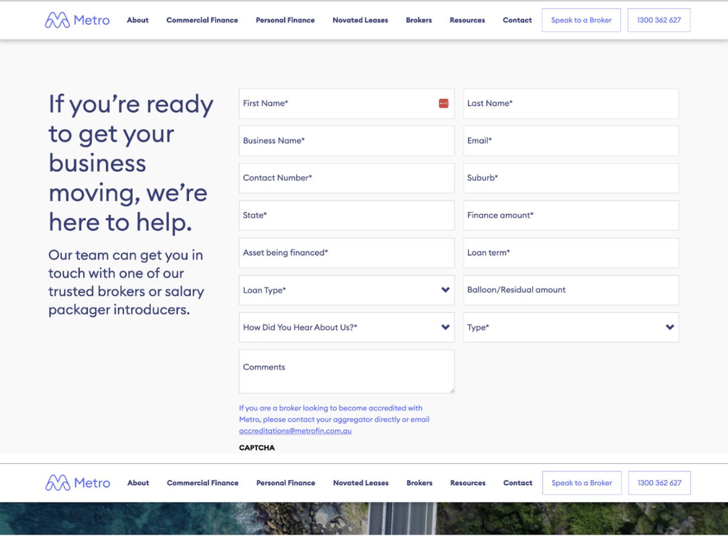
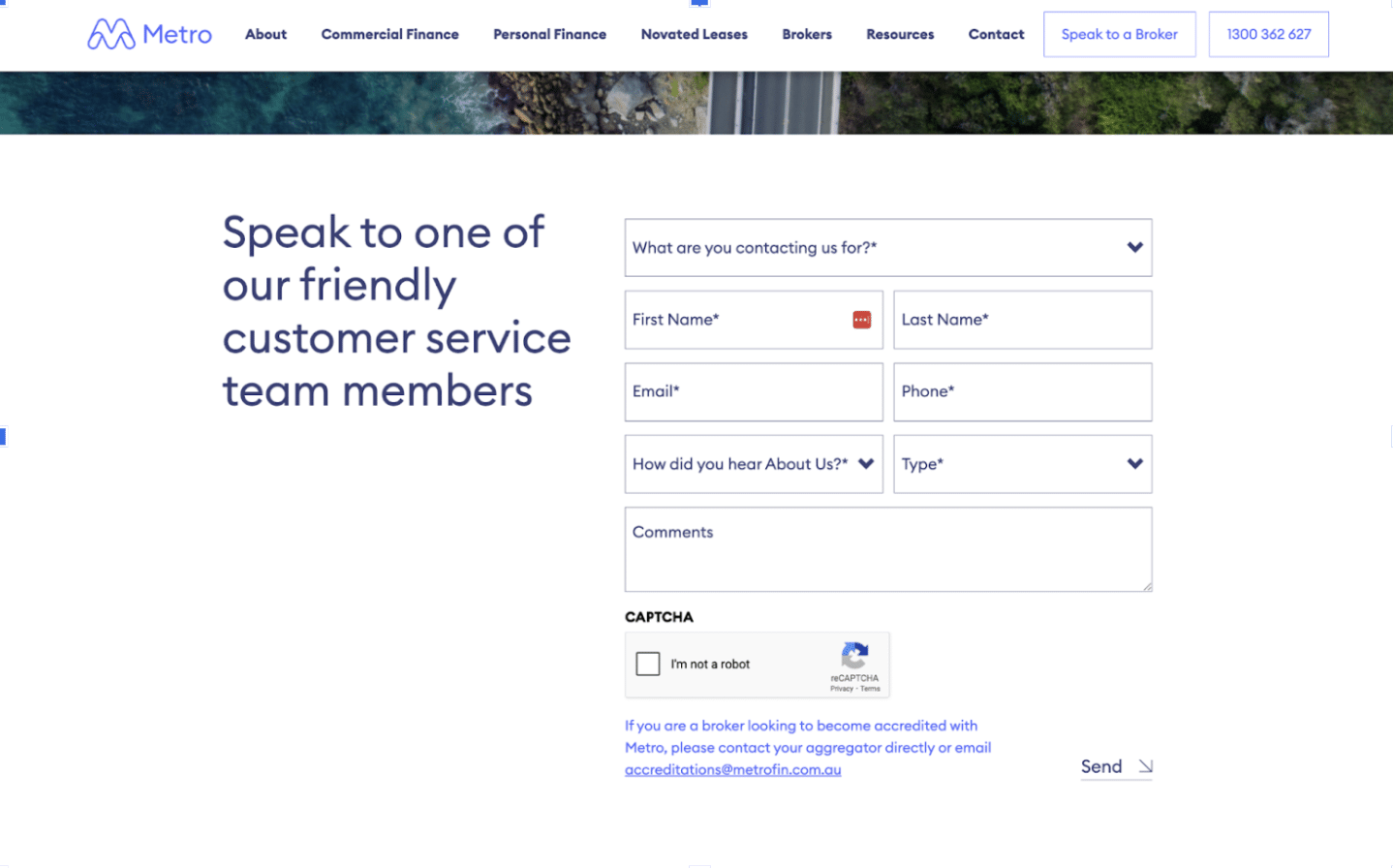
16. Minimal form fields
Every extra field in a form increases drop-off. In saying so, form fields also help you qualify users and manage their enquiry effectively.
So, ask only what you absolutely need from a user when asking them to fill out forms. The number of fields depends on the purpose of the landing page. Take Metro Finance for example - if you want to speak to a broker, they ask the user to fill a detailed form. But if you just want to speak to their support team, they only ask for minimal details.
You can A/B test progressive profiling, autofill where possible and clear field labels for a better UX.
17. Source congruency
Ideally, the landing page should match exactly the text and ad that brought them here. If a user clicks on one of your ads expecting X, show them X.
Consider adopt dynamic text replacement (DTR) or launching multiple landing pages tailored to each campaign or ad group.
Google Ads Smart Campaigns are great for these, as they tailor landing page text to match user queries.
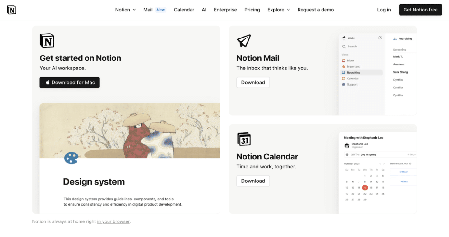
18. Brand consistency
Consistency builds confidence among users. If the visual style and tone of your brand's appearance shifts between ads, social posts, landing pages and other assets, it impacts user trust.
Keep fonts, colours and voice aligned across channels. We recommend creating a brand UI kit to ensure all landing pages match your master design system.
Notice the minimalist aesthetic and clear copy that Notion publishes; it’s mirrored across every landing experience.
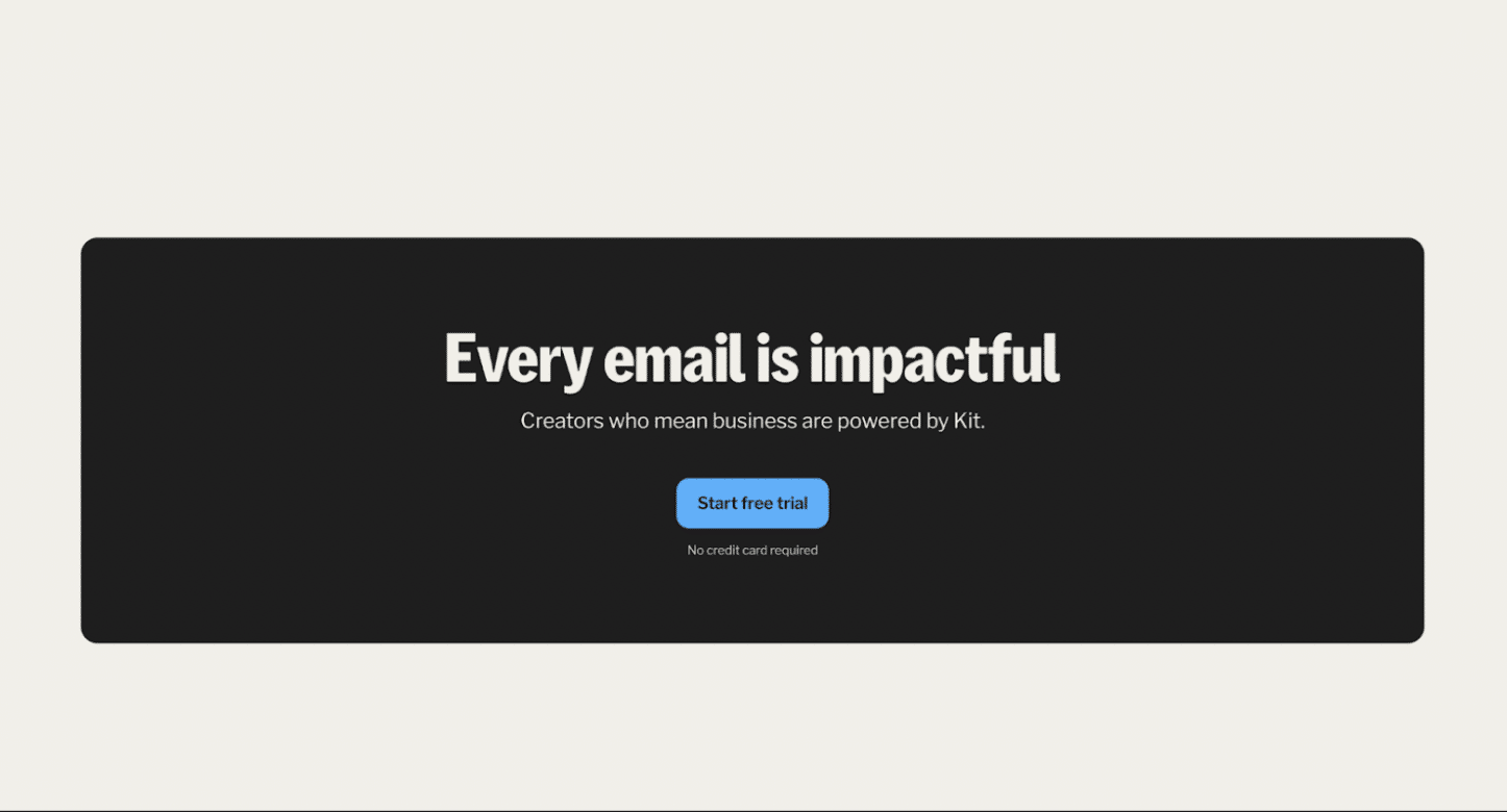
19. Visible privacy and T&C links
Users want to feel safe in a privacy-first world, especially when handing over their data. Reduce risk by letting people know you are legitimate.
Adding a trust signal near the form like “100% privacy guaranteed. No spam.” goes a long way. You can also add links to your privacy policy and make it readable rather than overwhelming, as is often the case.
ConvertKit includes “No credit card required” and “No spam” labels near their forms and CTAs.
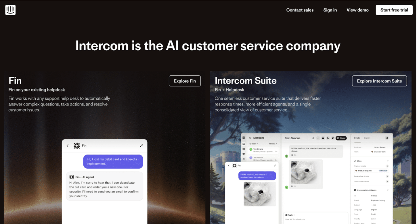
20. Make sure the next action is clear
Users love a logical next step.
Avoid multiple competing CTAs and if necessary, structure them hierarchically. For example, “Get Demo” can be the primary CTA and “Learn More” can be the secondary CTA.
A good example is Intercom’s homepage where CTA hierarchy makes “Start Free Trial” the focal point, with “Explore Fin” and “Explore Intercom Suite” as secondary actions.
Every detail matters
High-performing landing pages aren’t built on guesswork or pretty design alone. They’re a product of value, messaging clarity, good UX and an understanding of how real humans behave.
Whether you're optimising for lead gen, product trials or B2B demos, every element on the page plays a role - from headline to whitespace to the colour of your CTA button.
As a leading landing page design and optimisation agency, Rocket has helped brands across Australia turn more clicks into customers with landing pages that really work.
About the Author

Ash is Rocket's in-house Marketing Coordinator and the Producer of the Smarter Marketer Podcast. With a passion for marketing and sharp analytical skills, she excels at uncovering the hidden stories behind what drives marketing success.
Ash has worked with B2B SaaS companies in the FinTech and EdTech industries in Australia and India. She holds a Master of International Business degree from the University of Melbourne.
When not busy marketing Rocket, you'll likely find her brewing a delectable cup of chai.